
THE PULITZER PRIZES
2018–2024 CASE STUDY


GOAL
Beginning in 2018, I worked with administrator and board member Dana Canedy to identify strategic recommendations for The Pulitzer Prizes as it entered its second century. The brand needed to update its visual identity to support institutional goals such as promoting freedom of the press and encouraging a more diverse set of prize entrants.
BACKGROUND
The brand’s updated visual identity would need to live in the public space in conjunction with some preexisting brand assets, such as a wordmark, centennial trademark, and various anniversary publications that were developed by its 2016 creative agency for its centennial two years earlier.
The Gold Medal
The updated trademark needed to supplement and highlight the brand’s central symbol: The Gold Medal, which was designed in 1918 by Daniel Chester French and Henry Augustus Lukeman. At the time of the 102nd Pulitzer Prizes, The Gold Medal would have amassed 101 years of equity as a symbol for the brand, while the centennial trademark variations would have amassed three years (Exhibit 2). Rather than exist in isolation, the updated trademark needed to comport with these other symbols—rather than undermine their brand equity.
Exhibit 1: Timeline of Brand Symbol Introduction*

*Each rectangle represents one annual Pulitzer Prize announcement. In 2018, the primary brand symbols being used were the Gold Medal (A) and the centennial trademarks (B). After the 102nd Pulitzer Prizes, the updated trademark (C) would have been introduced as well.
Exhibit 2: Brand Equity of Symbols in Years*
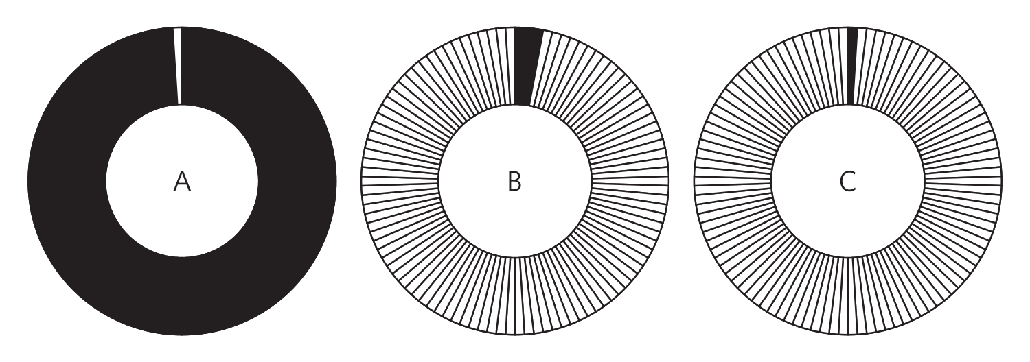
*Each solid black sector represents one annual Pulitzer Prize announcement. After the 102nd Pulitzer Prizes, the updated trademark (C) would have built up one year of brand equity, compared to three years for the centennial trademarks (B)—and 101 years for The Gold Medal (A). (The Gold Medal was designed in the second year of the Pulitzer’s existence.) Rather than exist in isolation, the updated trademark needed to comport with these other symbols—rather than undermine their brand equity.
TARGET AUDIENCE
While the The Pulitzer Prizes’ brand name was well-known to the general public, its trademarks would mainly be seen by prospective entrants, winners, finalists, publishers, and the press.
SOLUTION
The solution involved new trademarks and studio photography, process optimization recommendations for the announcement weekend, and a series of promotional materials which were used to launch the updated visual identity at the Next 100 Years soiree.
Trademarks
The updated trademark featured a three-line version of the wordmark that was positioned within a circular shape, reminiscent of the iconic Gold Medal. The “Pulitzer” portion of the brand name was centered within the ring, and the anniversary ring terminus points were repurposed to lead the eye directly to it (Exhibit 3). By drawing attention to the “Pulitzer” portion of the brand name, the mark achieved greater congruence with one-word communication channels (e.g., pulitzer.org and #pulitzer). The decision by The Pulitzer Prizes to reuse the anniversary ring shapes helped build continuity between the new trademark configuration and preexisting communications.
Exhibit 3: The Pulitzer Prizes Trademark Development

Process Optimization
Process optimization recommendations streamlined the coordination between three offices: The Pulitzer Prizes’ office of the board administrator, their public affairs partners, and their design partners. In previous years, native format files were passed back and forth between partners and quality assurance review redundancies were unnecessarily multiplied (Exhibit 4). The process was optimized in 2018 whereby user-friendly native format files were created for and then managed by the office of the administrator—reducing quality assurance review to singular feedback queries and enhancing the administrator’s autonomy over the process (Exhibit 5).
Exhibit 4: Example of Process Inefficiencies in Previous Year

Rows correspond with office oversight. Arrows stand for document progression. In the previous year, native format files were passed back and forth between partners and quality assurance review redundancies were unnecessarily multiplied
Exhibit 5: Optimized Process Reduced QA Review and Enhanced Board Administrator’s Oversight

Rows correspond with office oversight. Solid lines stand for document progression, and dashed lines stand for partner input points.
Due to the sensitive nature of the content during the weeks leading up to the announcement, the team produced and interspersed false content so that vendors were unaware of the actual list of finalists and winners (Exhibit 6).
Exhibit 6: False Content Interspersed with Usable Imagery Assets*

*The image file icons marked “X” represent an undisclosed number of false content files that were generated and interspersed with usable imagery assets. Each image file icon that is marked with a “moon and terrain” image represents three usable files.
Communication Design
Studio photography focused on The Gold Medal, busts of Joseph Pulitzer, winner and finalist books, and various Pulitzer publications and commemorative items. The office of the administrator signed off on brand colors (Exhibit 7) and Illustrations were produced of The Gold Medal for social media, which were used as Twitter cards and branded emojis for the hashtag #Pulitzer. The updated visual identity was launched at The Pulitzer’s Next 100 Years event in 2018, and the 102nd Pulitzer Prizes announcement increased livestream viewership by over 5X.
Exhibit 7: Color Study

*Contrast ratios are included on the third, fourth, fifth, and sixth columns. Note: WCAG Level AAA requires a 4.5:1 contrast ratio or higher for larger text and at least 7:1 for smaller text. The red “X” indicates where text and background color combinations failed both AAA and AA ratings.
Visual Brand Management
In 2019, the design strategy expanded to include sub-branding for winner and finalist medallions, which reinforced the visual identity of the parent brand by replicating essential elements: namely, the “Pulitzer” brand name, situated at a central focal point, and emphasized by the anniversary ring’s terminus points (Exhibit 8). The winner and finalist medallions helped unify the visual brand as publishers began to circulate them on book cover reprints. Other sub-brands, such as The Pulitzer Prize Book Club (Exhibit 9), was developed for launch in 2020.
Exhibit 8: Sub-branding for Winner and Finalist Medallions

Exhibit 9: Sub-branding for The Pulitzer Prize Book Club

The updated visual identity was also implemented for the Winners and Finalists book, environmental graphics at the New York Stock Exchange for the ringing of the opening bell in various years, and the Pulitzer’s interior design, which included wall graphics and a series of 21 environmental panels displayed on gold and navy shelves (Exhibit 10).
Exhibit 10: Development of Environmental Panels for Prize Categories

Each solid black rectangle represents a gold and navy shelf, which was installed on the eastern wall of the office’s entryway. Outlined rectangles visualize the invisible design grid, and the shaded rectangles indicate environmental panels—one for each of the 21 prize categories in Journalism, Letters, Drama and Music.
Pulitzer on the Road
In 2023, The Pulitzer Prizes needed to launch a new brand for their cross-country public outreach initiative, Pulitzer on the Road, which would celebrate the work of winners and nominated finalists in live events. The Pulitzer on the Road trademark, event materials, website, and podcast needed to supplement the preexisting visual identity while appearing accessible to new audiences and retaining its distinction. The primary target audience of The Pulitzer on the Road brand were university communities, venue users such as public library members, and podcast consumers of the fiction, history, music, and news/commentary categories. The solution involved a responsive trademark of the core Pulitzer typesetting situated adjacent to a motion blur of The Gold Medal.
Exhibit 11: Sub-branding for Pulitzer on the Road

Exhibit 12: Alternate Configuration for Responsive Trademark

The bifurcation between left and right with color and implied motion represented the Pulitzer parent brand in a respectable freeze-frame, with the ‘on the Road’ subbrand following behind. The Pulitzer on the Road podcast was launched in 2024 and its podcast ranking climbed by 3.8x the first month.